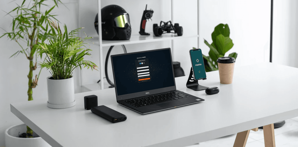
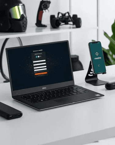
Meshio - Platform for Tech Hobbyists
Meshio - Platform for Tech Hobbyists
A community and skill-sharing platform designed to connect makers, tinkerers and developers in a supportive environment.
Project Type
Final exam
Duration
5 weeks
Collaborator
Sarah Kellner
My Role
UX Researcher & Designer
Main Tools
Figma, Miro, Excalidraw, Useberry, Canva
Project Type
Final exam
Duration
5 weeks
Collaborator
Sarah Kellner
My Role
UX Researcher & Designer
Main Tools
Figma, Miro, Excalidraw, Useberry, Canva
The challenge
The challenge
Tech hobbyists are creative and curious but often lack a dedicated online space that balances structure and community. Existing platforms are either too professional (like Stack Overflow) or too chaotic (like Reddit or Discord).
Our goal was to design a platform that feels organized yet approachable, where hobbyists can share their projects, connect with peers and find motivation to keep learning.
Understanding the user
Understanding the user
User personas:
Hannah - 32, Developer, Oslo - experienced hobbyist
Andreas - 25, Student, Bergen - beginner hobbyist
shared need: structured, supportive platform
Scenarios: Hannah looks for a structured platform to document and showcase her advanced projects and inspire others; Andreas wants an easy way to find beginner-friendly tech projects and get feedback to help him learn and stay motivated.
“I'd share more if I had a neat, easy-to-understand way to present my projects and get feedback from people who know what they're talking about.”
— Interview Participant A
Process Highlights
Process Highlights
The Design Thinking Process
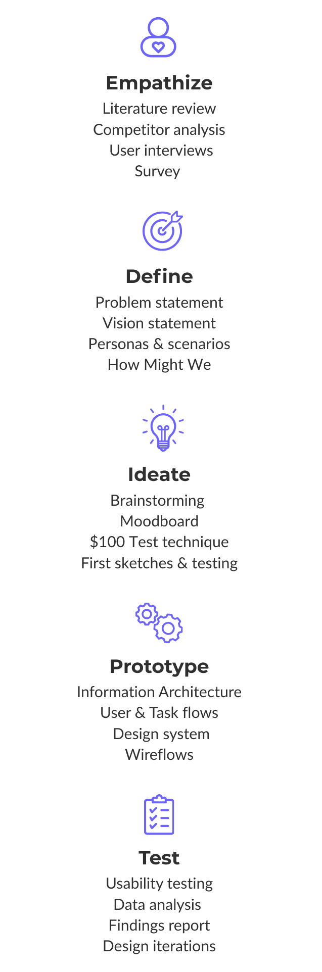

Empathize & Research
Empathize & Research
To begin with, we conducted a competitor analysis of 5 platforms - Reddit, Discord, Hackaday, Stack Overflow and Daily.dev.
Strengths: active communities, vast content
Weaknesses: lack of structure, poor discoverability, overwhelming interfaces
We continued the research with:
6 in-depth interviews with hobbyists (makers, coders and electronics tinkerers)
online survey - 38 responses (participants recruited on IT conference and through a tech hobbyist Facebook group)
Key insights: Hobbyists want a structured, friendly and visually clear platform, not another chaotic forum.


Synthesis & Insights
Synthesis & Insights
We organized data using affinity mapping and found out key themes:
Motivation comes from feedback, visibility and learning
Community support is more important than competition
Project organization and discovery are major gaps
These insights led to forming questions such as:
“How might we help hobbyists share projects clearly while feeling supported and recognized?”
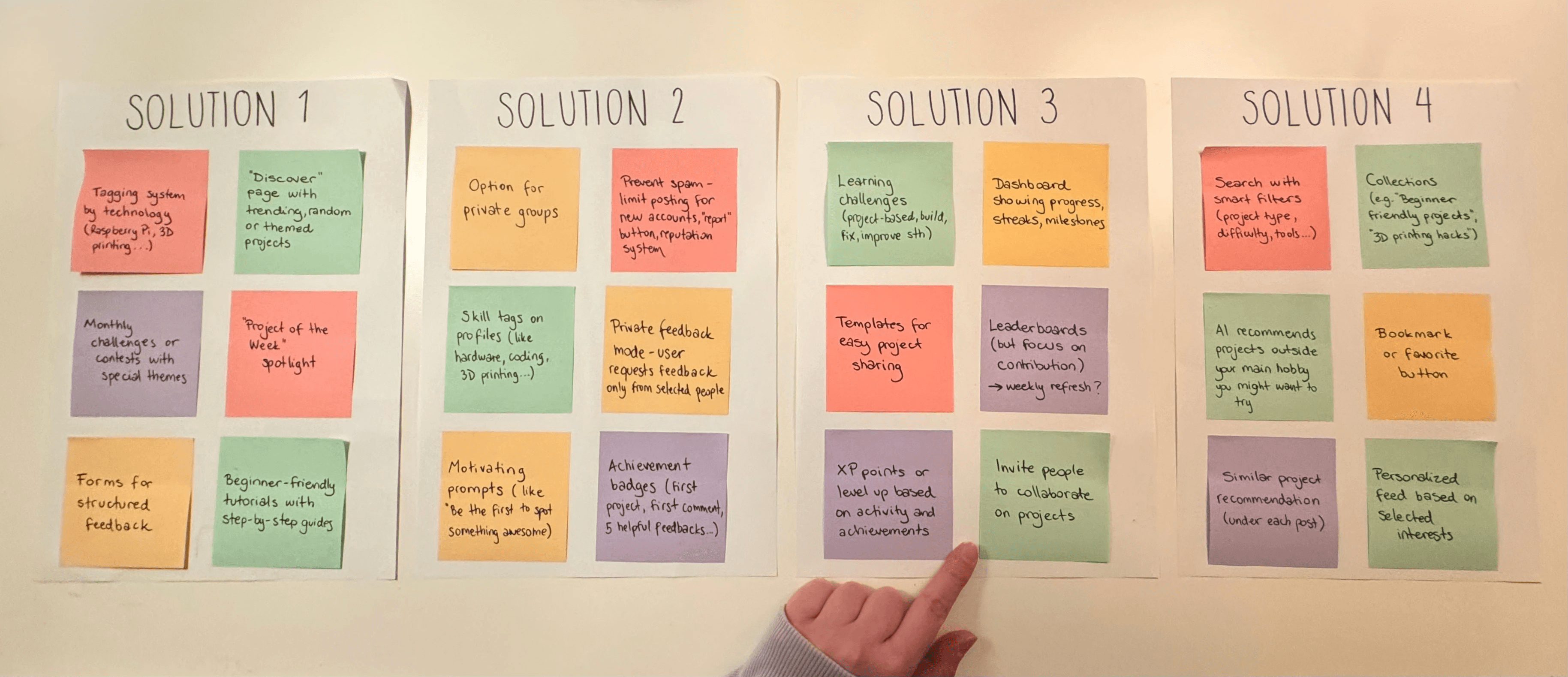
Ideation & Sketching
Ideation & Sketching
Next step was running brainstorming sessions and using the $100 Test technique to prioritize features.
The strongest ideas focused on:
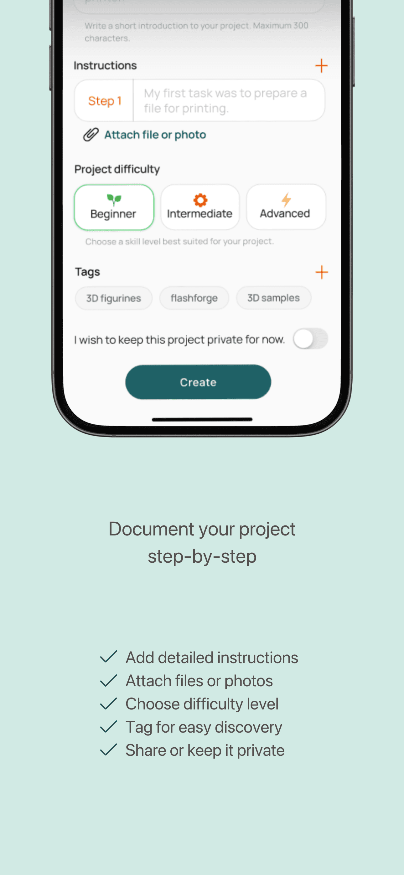
Structured project documentation
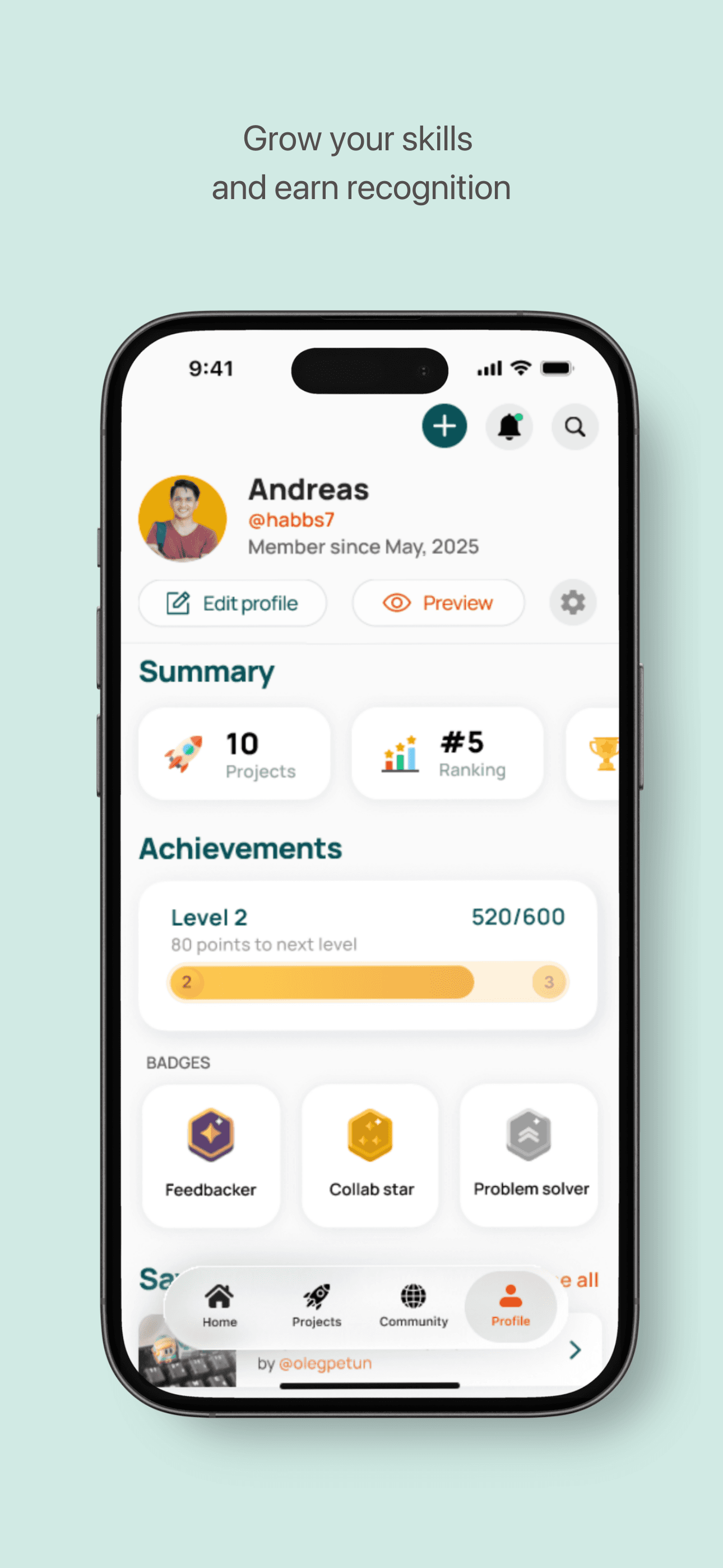
Gamified engagement (badges, levels, community challenges)
Curated tutorial exchange for peer learning
Then, we created early sketches and low-fidelity wireframes to visualize navigation and key interactions. We tested it with 2 tech hobbyists to get some more ideas.


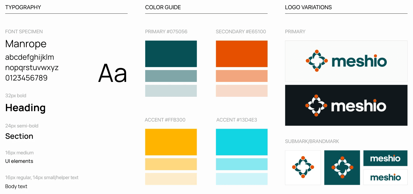
Brand Identity Guidelines
Brand Identity Guidelines
Before moving forward, we defined project's visual direction. When deciding on logo, color palettes and typography, we were guided by our brand's core qualities - being supportive, structured, fun and engaging.
Our typography choice, Manrope, is a modern sans-serif font. We chose it because it's very readable and sleek.
This helped us create an experience that feels both professional and friendly. Also, it served as a good foundation for our design system.
Fun fact: Meshio's name comes from the verb "mesh", meaning to fit or work together successfully.
Structure & Flow
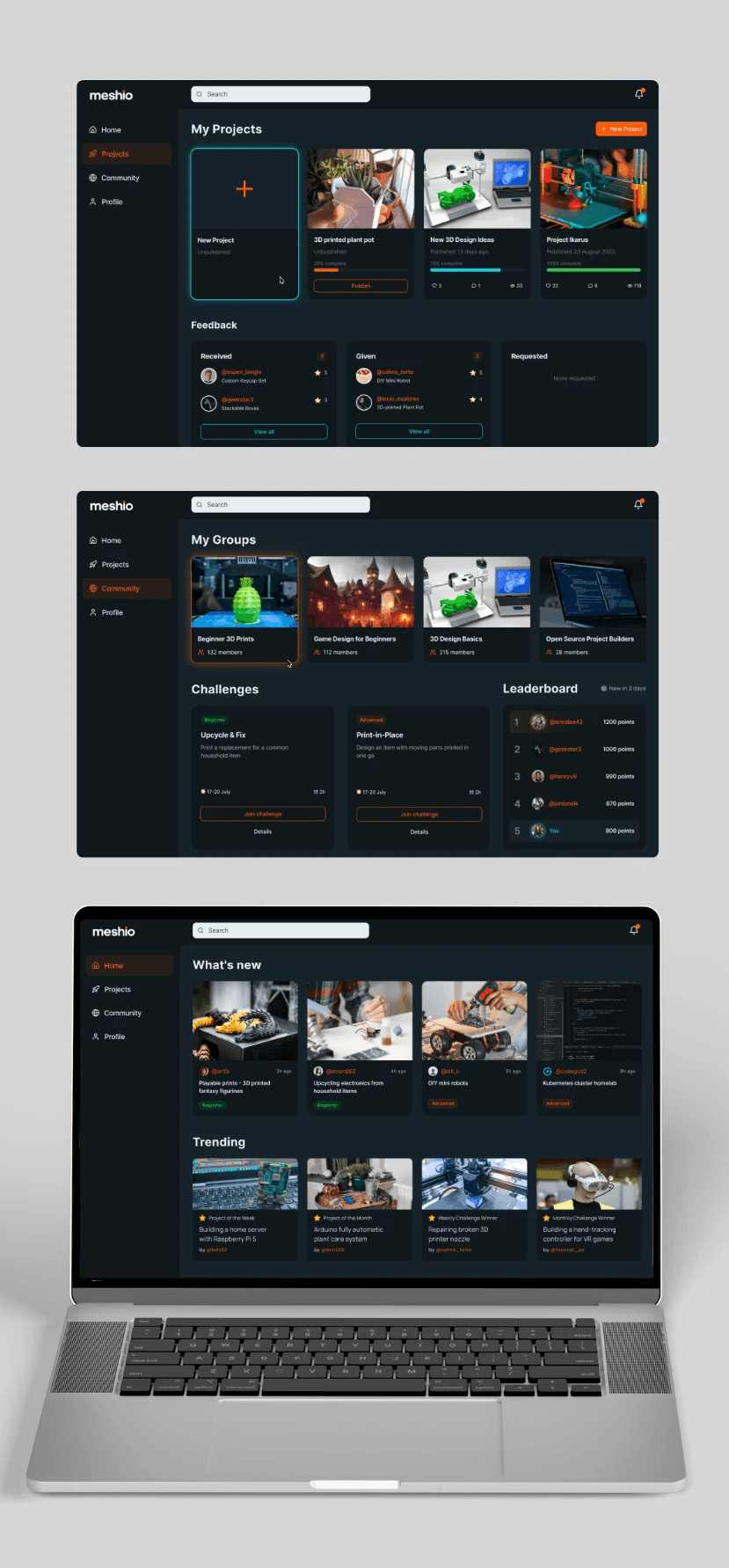
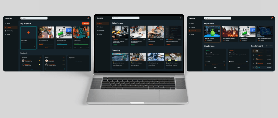
Next up was mapping out the Information Architecture, User and Task Flows for both desktop and mobile views to ensure consistency and logical navigation.
Key paths included:
Signing up and customizing a profile
Creating and publishing a project
Browsing, giving feedback and saving others’ work
This structure was important for creating wireframes and prototypes.

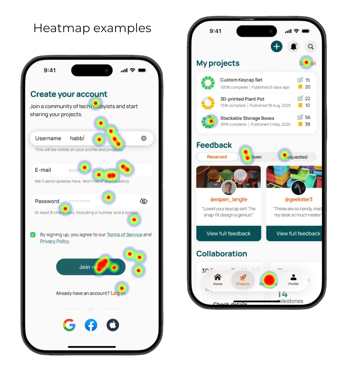
Prototyping & Testing
Prototyping & Testing
We developed an interactive prototype and conducted 15 usability tests (moderated + Useberry).
4/5 overall satisfaction rate
Strong satisfaction with quick actions, gamification elements, mobile flow
Most common issue: inconsistent layout between desktop and phone
After adjustments, we improved:
Clarity and layout consistency
Accessibility (contrast, spacing, focus states)
Visual hierarchy and feedback flow
Task success rate (mobile)
Errors/confusion rate (mobile)
Task success rate (desktop)
Errors/confusion rate (desktop)
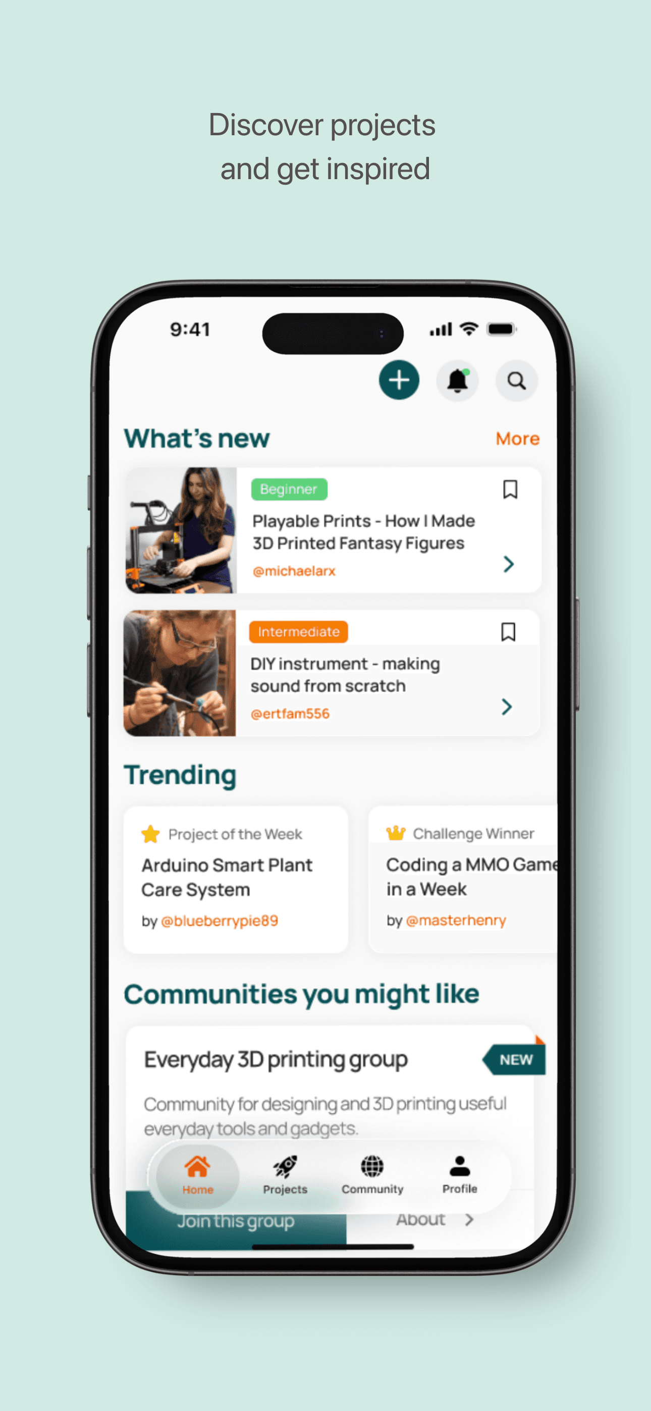
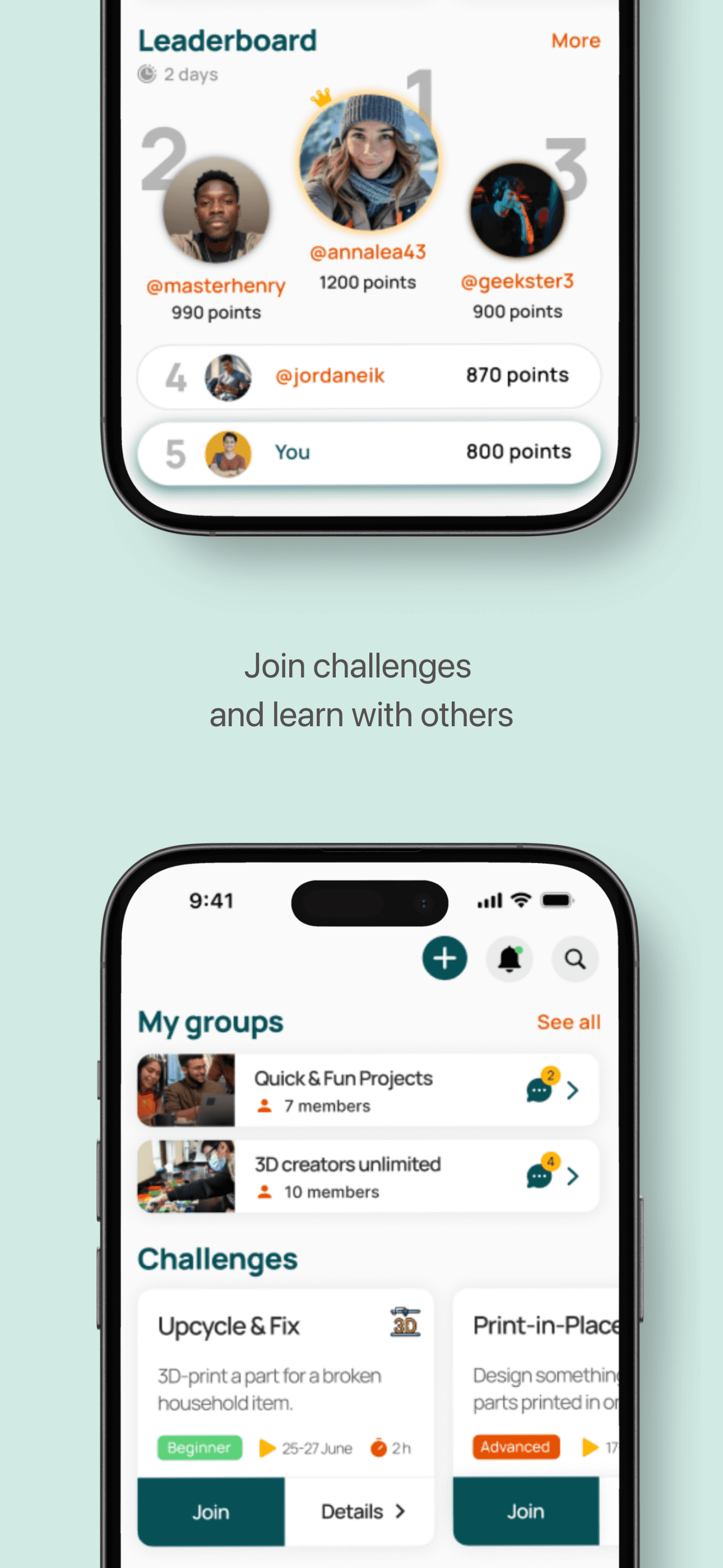
Final Design
Final Design

Reflection
This project was a wild ride - full of research, testing and experimenting! I tried the liquid glass style (mobile navigation) for the first time and played around with horizontal scrolling as well. My favorite part was working in Figma and testing the prototypes with real users!
What I learned:
Planning and managing a full end-to-end UX project
Building inclusive, community-oriented platforms
How to combine both qualitative and quantitative data
The great value of iterations and measurable testing
This project was a wild ride - full of research, testing and experimenting! I tried the liquid glass style (mobile navigation) for the first time and played around with horizontal scrolling as well. My favorite part was working in Figma and testing the prototypes with real users!
What I learned:
Planning and managing afull end-to-end UX project
Building inclusive, community-oriented platforms
How to combine both qualitative and quantitative data
The great value of iterations and measurable testing
Areas for improvement
Areas for improvement
If I continued working on this project, I would:
Continue iterating and do more testing
Replace carousel sections on mobile with vertical scroll
Design more parts of the app (like settings menu)
Improve challenges section and gamification generally
Explore extra features like AI-driven recommendations and moderation features
Explore how to make users more motivated and engaged
Project handover in September 2025