Angstforeningen - New Website & Visual Identity
Angstforeningen - New Website & Visual Identity
A UX-driven brand and website redesign for a Norwegian
non-profit organization supporting people living with anxiety.
A UX-driven brand and website redesign for a Norwegian non-profit organization supporting people living with anxiety.

Project Type
Client Project
Duration
Ongoing
Company
Thomashawk AS
My Role
UX Designer
Main Tools
Miro, Figma, WordPress

Project Type
Client Project
Duration
Ongoing
Company
Thomashawk AS
My Role
UX Designer
Main Tools
Miro, Figma, WordPress
About the client
About the client
Angstforeningen is a Norwegian non-profit organization supporting people living with anxiety and their relatives. It combines professional knowledge with lived experience, offering peer support, conversation groups, educational resources and guidance, without providing diagnoses or clinical treatment.
Approaching its 40th anniversary, Angstforeningen wanted to replace an outdated website and visual identity to celebrate the milestone, become more visible nationally and make it easier for people to find help.
My role
My role
I worked on the project during my UX design internship at Thomashawk AS, where I contributed to several client projects. For this project, I focused primarily on the research and ideation phases, which included planning and facilitating workshops, developing the research survey, organizing insights, brainstorming and collaborating with the client and design team.
Alongside the project, I also developed an internal knowledge base on accessibility and universal design, which informed many of the considerations we brought into the research and design process.
“The website should give the impression of 'Now I've come home' - here I can finally get the information and support I need to learn more about my anxiety.”
— Anonymous research survey respondent (translated from Norwegian)
Process Highlights
Process Highlights
Research Principles


The challenge
The challenge
Someone visiting Angstforeningen’s website may already feel stressed, tired or unsure about what to do. Long pages can become difficult to process. An unclear button can create doubt. A person may hesitate to call because they do not know who will answer or what will happen next.
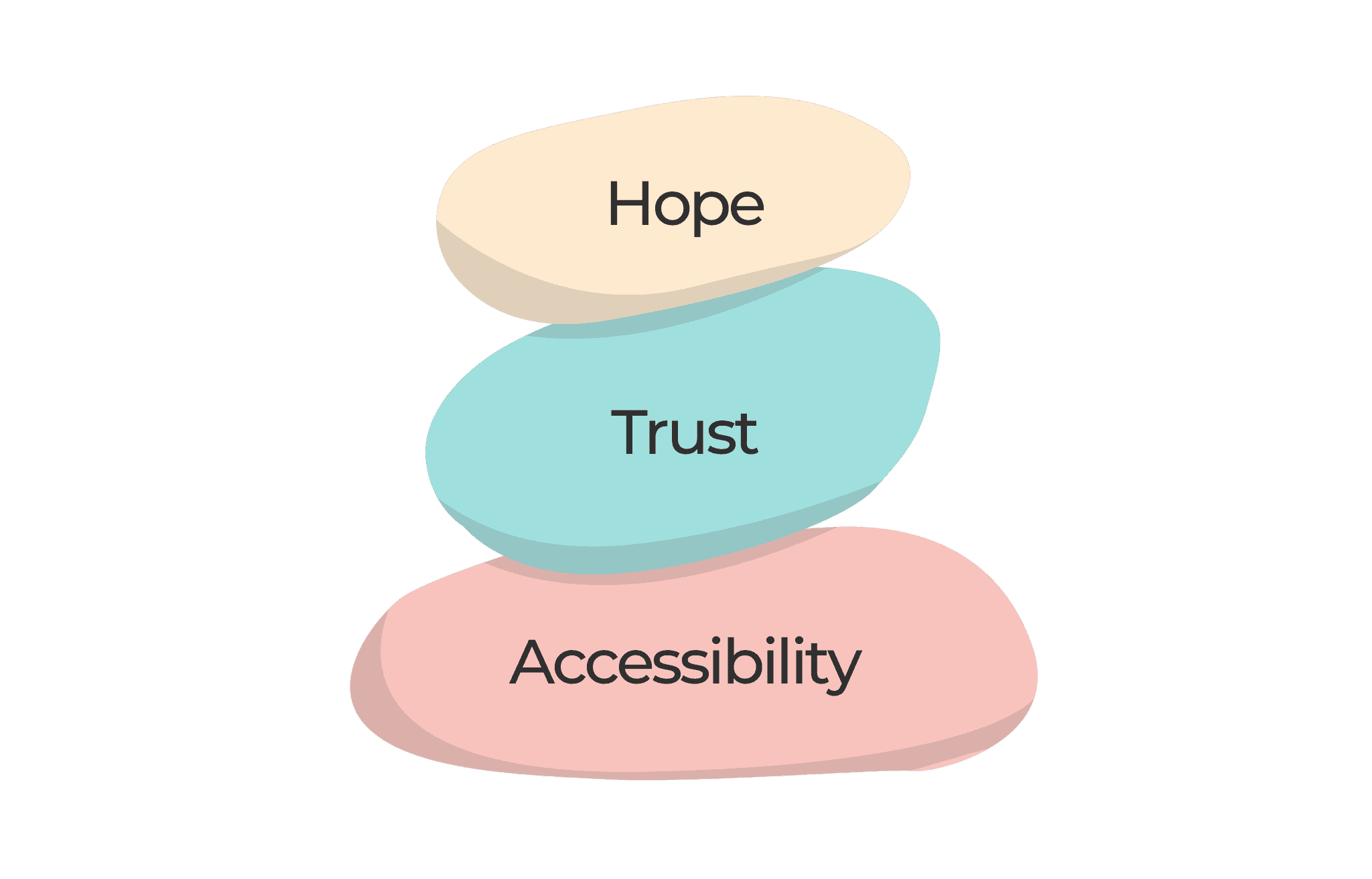
The challenge is to help the organization feel easier to understand and safer to approach. Therefore, accessibility is a core design requirement. The new website needs to reduce uncertainty, explain choices and allow people to process information at their own pace.


Accessibility first
Accessibility first
At the start of the research phase, my boss and i joined a DOGA workshop on designing for neurodivergence, held in collaboration with WIP Institute. Through shared experiences, presentations and exercises, I gained a lot of inspiration and a deeper understanding of how small design choices can make everyday life easier for people with different cognitive needs.
These insights informed our work with Angstforeningen and helped me expand company's internal knowledge base on accessibility, universal design and inclusive design practices.
Setting direction
Before asking users what they needed, we closely worked with Angstforeningen to clarify what the organization itself was trying to achieve. Together, we defined the main target groups, project goals, responsibilities and expectations for the collaboration.
We also reviewed the current website. The purpose of the organization was difficult to understand from the opening section, important support information was hidden in text and several messages were too abstract to guide users. This gave us a clearer view of what the research needed to investigate.
We also explored comparable organizations and identified opportunities extending beyond a standard redesign, including stronger support for recruitment, local activity, content sharing and national visibility.


Working together
Working together
Our first workshop brought together project-group members and people with different connections to Angstforeningen.
They shared experiences from working with members, local teams, conversation groups and people looking for help. We explored expectations, risks and ideas for the website, visual identity, content, imagery and local pages.
Instead of presenting ready-made answers, we created space for the organization to explain what mattered and why. It was great to include everyone in shaping the project straight from the beginning!
Listening to users
To reach beyond the project group, I helped create an anonymous survey for people living with anxiety, relatives, members, volunteers, employees and local representatives.
We built the survey as a conversational form in Wordpress (hosted by Thomashawk / company website). This allowed us to gather broad input while keeping the experience simple and anonymous.
The survey showed how people viewed the current organization and what they expected from its content, functionality and visual expression. A follow-up workshop and in-depth interviews helped us further explore the important themes, like accessibility, trust, local activity and national visibility.


Research synthesis
Research synthesis
I organized the material from the survey, workshops, interviews and audits in Miro. I grouped repeated observations, so we got key directions.
All these insights gave us a strong basis for decisions about content, structure, tone, imagery and the refreshed identity, as the project moved further into the design phase.
found the current identity and website dated or unclear
would prioritize self-help tools and access to human support
want the new experience to feel safe and welcoming
survey response rate (59 of 163 invited)
Current status: Discovery, research and synthesis completed · Identity and website design in progress
A foundation for design
The research helped the team define:
Which target groups the experience must support - what needs to be designed, for whom and why
What information people need first
Important content and user needs
Which accessibility principles should guide the design
How the organization should communicate
How national and local content should work together
The work provided a shared reference point for later decisions about the website structure, visual identity and content. Because the website hasn't launched yet, I cannot claim measurable user impact.
The research helped the team define:
Which target groups the experience must support - what needs to be designed, for whom and why
What information people need first
Important content and user needs
Which accessibility principles should guide the design
How the organization should communicate
How national and local content should work together
The work provided a shared reference point for later decisions about the website structure, visual identity and content. Because the website hasn't launched yet, I cannot claim measurable user impact.
Reflection
Reflection
This project taught me that accessibility often begins before anyone interacts with a component. It begins with the amount of information on the page, the expectations created by a heading and whether a person understands what will happen after they press a button.
I also saw the value of bringing different voices into the process early. The combination of lived experience, organizational knowledge and wider audience research helped us shape a direction that neither the design team nor the client could have created alone.
I'm incredibly grateful for this experience and for everything I learned along the way! It was amazing to contribute to something so meaningful and feel that my work could make a real difference.
Planned launch: October 2026